
Strikingly Fresh Branding : Eat Yer’ Greens
At Och & Aye, we love working with brands that not only stand out visually but also stand for something meaningful!
Our recent collaboration with Eat Yer’ Greens was the perfect opportunity to craft a bold and engaging identity for an online nutritionist passionate about making vegetables the star of every plate.

The challenge was to create a brand that felt fresh and vibrant — something that would break through the noise of the wellness industry while staying true to its core message: eating more vegetables should be easy, enjoyable, and part of everyday life.
- Bonnie Beaton
Eat Yer’ Greens
Colours
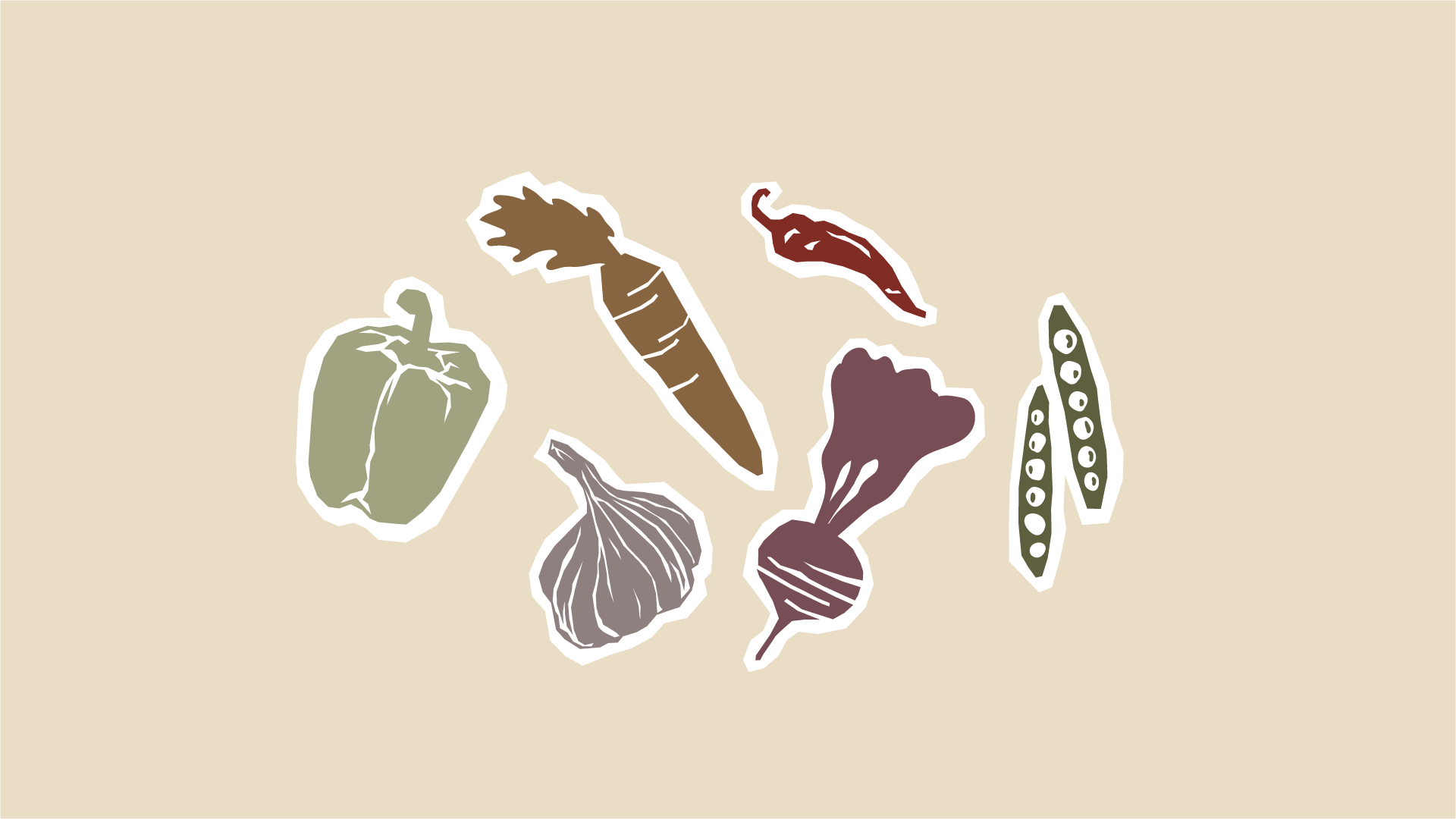
We started by developing a strong visual foundation, using a seriously deep green paired with pops of colour inspired by root vegetables and leafy greens.
Brand Fonts
The typography balances a friendly, modern feel with a slight vintage touch, reinforcing both trust and warmth.
Brand Assets
Playful, hand-drawn vegetable illustrations add personality and movement, ensuring the brand feels engaging across all platforms.


From the primary logo to stickers, profile images, and a striking banner, every element was designed to create a cohesive, standout presence online. The brand stickers, featuring fun, motivational phrases like "Dinnae ditch yer veg!", add a uniquely Scottish charm, making healthy eating feel more relatable and encouraging.
The final result?
A visually compelling, instantly recognizable brand identity that makes nutrition feel exciting rather than intimidating. With Eat Yer’ Greens, healthy eating gets a fresh new look—one that’s as bold as the mission behind it.